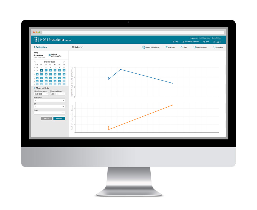
The purpose of presenting line graphs is to enable healthcare staff to quickly distinguish trends in the health of a patient through the simultaneous comparison of several time series (lines). An individual line graph is used to show how the health of a patient has changed over time, i.e. the graphs present different values selected over time.
Which data is visualised
Visualisation allows several different line graphs to be superimposed onto each other to quickly reflect and illustrate complex correlations between the different conditions of the patient and their state of health.
The visual expression over time is completely controlled by healthcare staff and is configured on the basis of each individual set of diagnosis-specific needs.
HOPE Platform makes it possible to show line graphs for all registered numerical values for an activity. Visualisation can be based on individual registered values in different forms or registered values from devices such as weight and number of steps.
They can also be based on scores obtained by the patient over time on the basis of evidence-based clinical protocols. The score is produced using the calculation service in the Clinical decision support building block.
Vill du veta mer om våra lösningar?
Fyll i din e-post och/eller telefonnummer så hör vi av oss inom kort!
Vi använder cookies för att se till att vi ger dig den bästa upplevelsen på vår webbplats.OkPersonuppgiftspolicy